
Table of Content

Ifat Chitin Morrison is a Full-Stack Developer in Panaya’s ForeSight group. Ifat has developed exciting features in ForeSight, such as the Impact Analysis Graph and the Salesforce Org Overview, which bring unique value to Panaya’s customers. She joined Panaya 2.5 years ago, and after 13 years as a Back-End Developer, she fell in love with the exciting world of Front-End Development.
Behind the Scenes of our Salesforce Graph
In this article, I will share how the dev team at Panaya developed and built our Impact Analysis graph inside Panaya’s ForeSight for Salesforce. If you missed my first article, I invite you to read it.
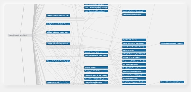
Take a look at our previous graph
As you can see, our previous graph displayed the relations of the components in a Salesforce org in a cluttered way.
What do you think about this?
Develop something extraordinary!
It was clear from the beginning that we aim to develop something extraordinary, which would become the main workspace for ForeSight customers and provide them with the best possible User Experience.
Our amazing Product Managers, UX and Design teams put together a mockup to be developed.
In R&D, we researched the many graph APIs that were out there. Our application is written in TypeScript and Angular. Candidates like d3, vis and Cytoscape.js were researched, and ultimately – Cytoscape.js was the one selected. Cytoscape.js is a wonderful library for both visualization and graph algorithms. I created a POC and was amazed by its velocity. It was super-fast and was able to show a huge graph of 5,000 nodes and 3,000 edges in just a few seconds. The API was extremely convenient, and I felt I could do anything with it. I got a green light from all stakeholders and started using it in April 2019.
From there on, it was a love story!
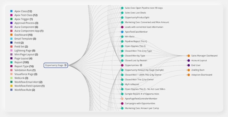
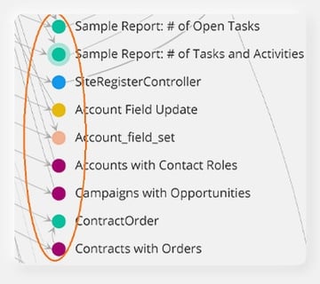
I started giving the graph the special look and feel that our UX and designers prepared. Each node (which represents a Salesforce component) was given a special color:
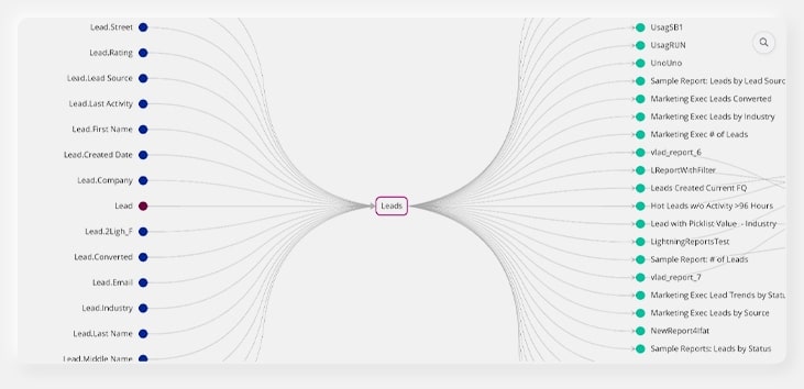
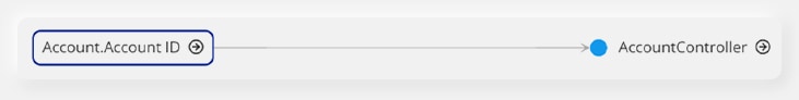
I then changed the edges to be curly and gentle, by defining their Bezier type as a function of the nodes’ locations. As you can see in Figure 3, edges of further nodes got a bigger curl.
How would we organize the nodes within a column?
The graph is built as a “hierarchy graph”, meaning that each column shows nodes with direct relation to the nodes in the previous column. But then I faced a new challenge: I had to organize the nodes within a column.
So, I developed two algorithms:
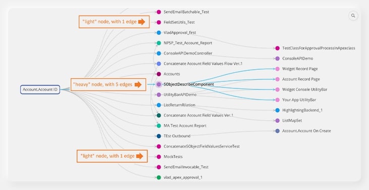
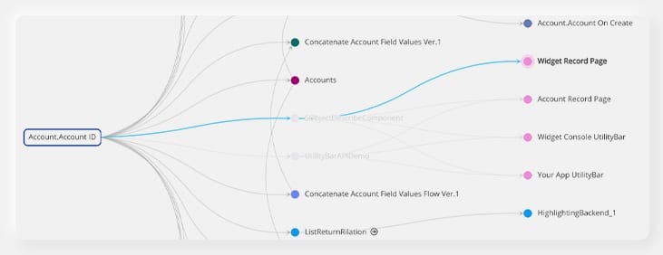
For the first column (after the root, which is the graph starting point), I put the “heavy” nodes that have a lot of relations (incoming and outgoing edges) in the center, and the “light” nodes on the top and bottom. Check out the result in figures 4 and 5.
For all other columns, each node is put in the closest position to its parent. This way the edges do not override each other, and the graph looks like it is “combed” 😊
To accommodate all the incoming and outgoing edges while maintaining a neat visualization, I decided to define 12 points (degrees) on the node where edges can either come in or out. The UX Team were very supportive of this decision.
Finding the paths in the graph with Cytoscape.js built-in algorithm
To find all paths in the graph I used the Dijkstra algorithm, which was extremely easy to use in Cystoscape.js as it is a built-in algorithm. To make it even faster, I made the paths calculation lazy and cached all paths for each graph after calculation.
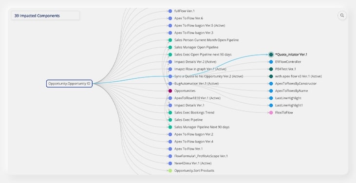
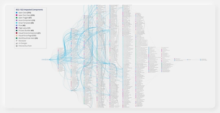
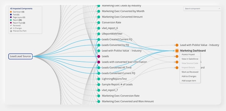
Here is an example of a complicated graph with many possible paths between all the nodes. Clicking on any node, highlights its path from the root on the left to the rightmost column in the graph, almost immediately.
And then… The Graph went live!
When we felt the graph was stable enough, we asked the entire team of ForeSight developers, managers and QA, to perform a bug hunt, to find bugs before they reach production.
Then, in July 2019 the graph was released, making our users very happy! They were now able to finally see the whole picture in a graphical way and perform actions from within the graph.
From graph to “mini application”
Filtering: This was necessary in order to show our users the small details in the huge picture. I enabled filtering throughout the graph legend as well as dedicated filters outside of the graph. When entire paths are filtered out, we marked them with a special icon.
When only some nodes within a path are filtered out, we faded the paths to these nodes. It was crucial for us to give our customers the full picture, at all times, even when some parts of the graph were filtered out.
Animations: I used a Cytoscape’s built-in capability to animate our graph, each time we filter it. Check it out!
Search: I developed search capabilities in the graph, with navigation to results (panning the graph to the result’s location). I developed a graph container Angular component that holds the graph, the legend, and the search components. This container performs the orchestration between the search component and the graph component, and asks the graph to search or navigate to a search result each time the user performs a search.
Keeping it stable and robust
Automation tests were a challenge since the graph is rendered as an HTML Canvas and we could not click on its nodes and edges using Selenium. So I leveraged Cytoscape’s useful API of serializing the graph into a JSON object, and got the nodes locations from there. This allowed us to perform smart clicks on the canvas and automate all important scenarios on the graph, without compromising on the stability and robustness.
How Our Customers Describe ForeSight
★★★★★
A must have tool for any Org.
“This application is awesome. It saves us a lot of time for any new projects we undertake. Usually, analyzing a component would take days or even weeks to identify all areas it affects. With Panaya it only takes a couple of minutes sometimes in seconds. It provides a clear cut picture for any salesforce component and definitely a must-have for any Org. This is an Admin and Developer’s best friend.”
★★★★★
Best app for your heavily customized org!
“I think this is the most powerful, most useful app we’ve purchased. Just let Panaya know what you are about to change and you’ll get all impacted components right away. Plan your changes and tests in a click of a button. This app saves us hours of investigation efforts before each change and most important- prevent bugs and failures of the system. If your org is heavily customized, this app is a must.”
★★★★★
Great time saving tool
“We’ve had the ForeSight app for a short time but it has already proven its worth by saving us so much time on a weekly basis! The on boarding process was second to none and the level of support we receive couldn’t be more responsive and friendly too. I highly recommend this app.“
Reviews above are from the Salesforce AppExchange. See more here >
Thank you for reading about our journey!
By breaking this huge amount of work into small pieces and tackling them one at a time, we could create this wonderful mini application that is so meaningful to our users and now serves as the main working space in Panaya ForeSight.
I would like to thank all the amazing people who helped make this dream come true!
Want To Learn More About Panaya ForeSight?
- Start your free trial of ForeSight for Salesforce
- Check out our Resource Center
- Follow us on Linkedin, Twitter, YouTube and Facebook
We’re Hiring!
Apply now on our Career Center